Menu Match
Prompt: What does your favorite restaurant look like in a post-pandemic world?
While the restaurant industry is ever-changing and constantly evolving to meet the next greatest trend and cuisine craze, most hope to also achieve, maintain, and even exceed the customer service and experience expectation. Personal touches focused on the comfort, needs, and preferences of customers create standout experiences, adding to the overall customer encounter. Our team set out to design elevated dining options focused on ordering alternatives for customers who struggle with challenges such as dietary restrictions and decision fatigue. As we implemented and tested our design, our team concluded that this enhancement should be an additional support when ordering and not an exclusive choice for those customers who may struggle to adapt to new concepts and technologies.
Research
Surveying - - Ethnography - - Competitive Research - - Interviews - - Journey Mapping
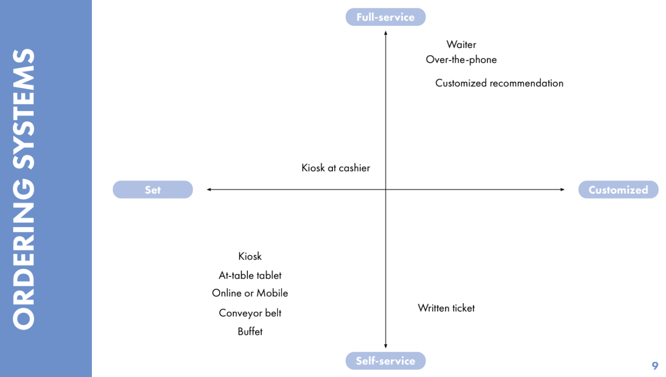
2x2 Matrix Competitive Analysis
An overview of different ordering and payment systems to help us identify openings in the restaurant industry.
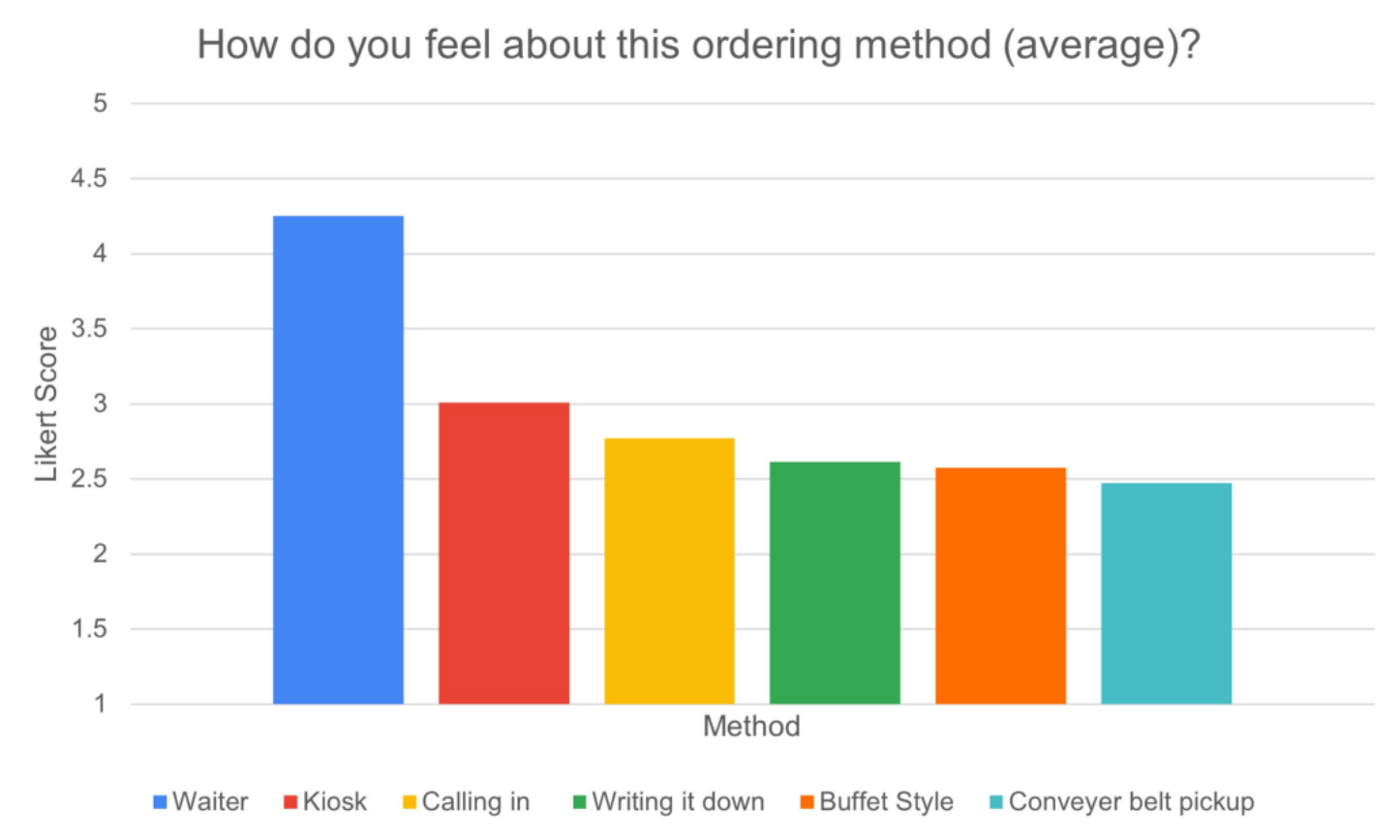
Important Survey Analysis
A series of results accumulated from over 300 survey results to inform future directions.
Journey Map
A map of the customer’s time in a restaurant from three different stakeholders’ perspectives: Customer, Employee, and Management.
Key Takeaways
Key Takeaway 1
Users enjoy going to restaurants for the social aspects, so the experience should enhance conversation and the group experience.
Key Takeaway 2
Users like ordering from human waiters over other methods and find the human interaction comforting, so it should not be overshadowed by technology.
Key Takeaway 3
Users go to a restaurant to relax and be waited on, so the restaurant environment should revolve around the user and how each aspect of their experience affects them.
Aspirational Journey Map
A map of how we want our final product to affect the customer along their restaurant journey.
Initial Concepts
Chosen Concept
Rapid Lo-Fi Modeling - - Medium Fidelity Modeling
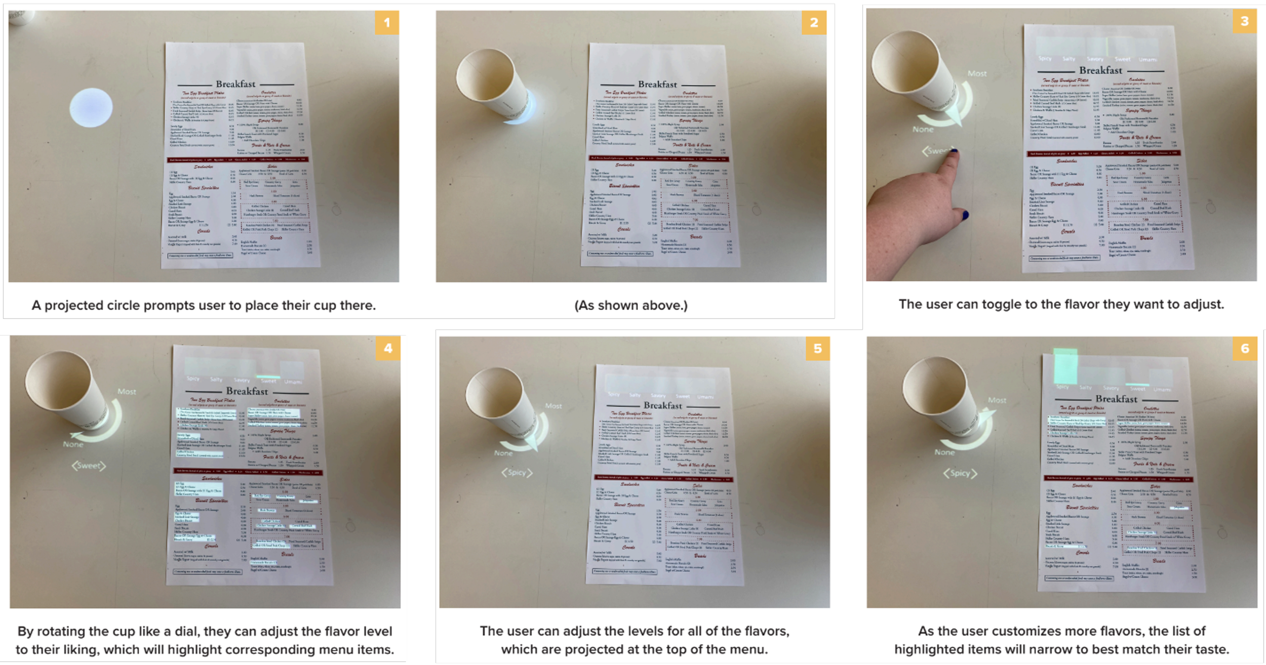
Chosen Concept First Iteration
Chosen Concept First Iteration Walk Through
User Testing
Surveying - - Wizard of Oz Testing - - Mockup Design
List of Tasks to Complete in Testing
The administrator read instructions from a script and the participant was led through several different tasks using the interface. They were observed during this time and notes were taken on their confidence, response, and any deviations from the expected reaction.
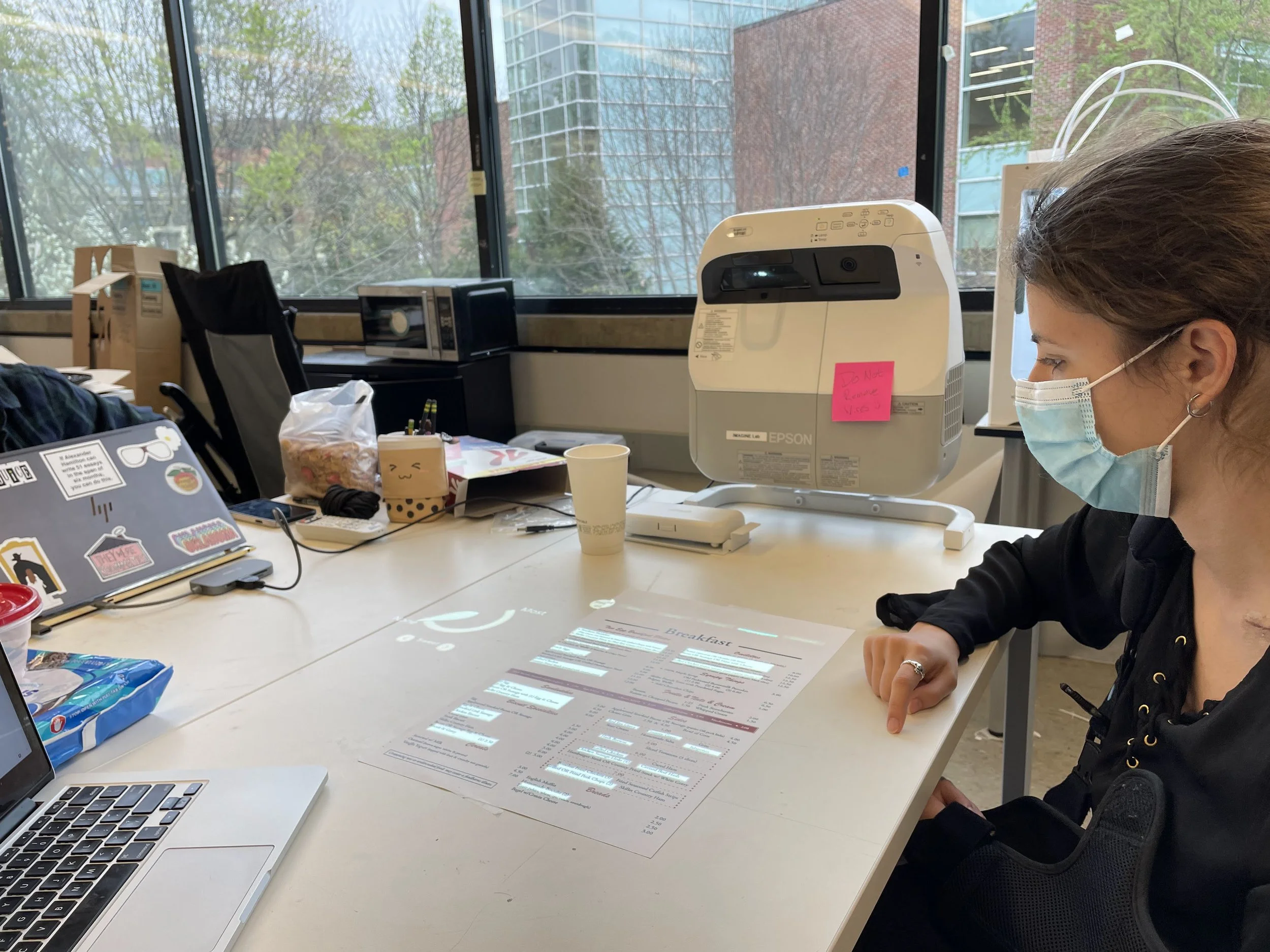
Active User Testing
Utilizing an Epson EB-485Wi to project light onto a physical paper menu affixed to a table, a laptop was connected to the projector via an HDMI cable so the test proctor could change the highlighted content as the user interacted with the menu, to mimic our desired interface.
Testing Survey Results
Participants took a survey on how they recognize and categorize flavors. We later analyzed their responses to get a baseline of how the general public perceives flavor.
Top Flavor Profiles (Unprompted):
Sweet, Salty, Spicy
Top 5 Flavor Profiles (Prompted):
Sweet, Salty, Creamy, Spicy, Fresh
Multiple mentions of textural & temperature words
Warm and Crunchy
Decision Fatigue & Information Overload
Users prefer to rate dishes on a Likert scale than guessing a dishes ranking.
Prompted Flavor Profile Results
Key Takeaways
Key Takeaway 1
Lighting could be an issue for users. The area must be dark enough to see projected light.
Key Takeaway 2
Users wanted to use their hands more than using other tools like silverware or cups to interact with the UI.
Key Takeaway 3
Users found some of the cues and signifiers insufficient. Some potential features to add would be micro-animations and multiple places for similar actions.
Final Concept
3D Modeling - - Rendering - - Videography - - Graphic Design - - Technology Research
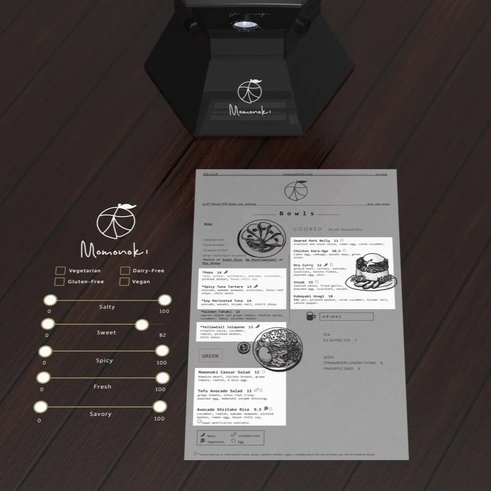
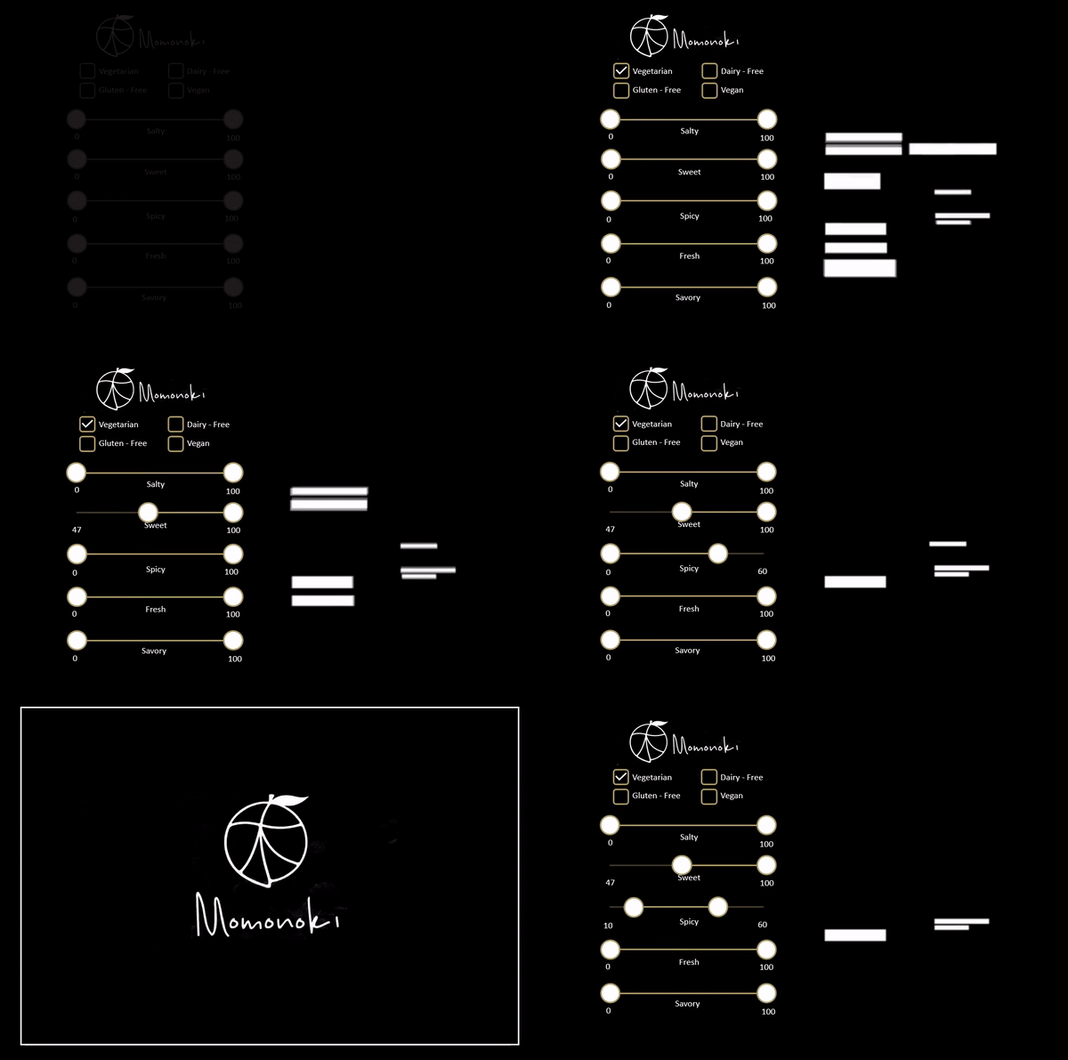
Menu Match is an interactive menu projector system that gives restaurant-goers the ability to filter and customize their menu. Using finger touches on a physical menu, users can check off dietary restrictions and adjust sliding scales for different flavor profiles (i.e. savory, salty, sweet, spicy, fresh), which will subsequently narrow down menu choices by highlighting them. These sliding scales can be adjusted to have minimum and maximum percentages of flavors.
30-Second Commercial
2-Minute Video
Hero Shot
Changing Menu in Context
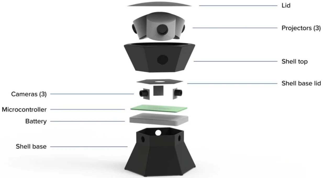
Exploded View
Example System
Olive Garden Example Menu
Jinya Example Menu
System in Context
Next Steps
Further user testing is needed in a restaurant setting and lighting.
Look into restaurant specified flavor profiles and coding those.
Identify other applications of the system to the dining process.
